Frequency Polygon Vs. Ogive: Frequency Polygon and Ogive are two ways that are very common in representing statistical data. They do this by representing it in different ways and different things. Although the two methods may seem closely related, they are very different. In this brief, we are going to lay down all the differences between the two statistical methods. Typically for online e-commerce statistical method for beginners, this one guide walk you through the keys for A/B testing.
So What is the The difference between a Frequency Polygon and an Ogive?
1. The definition-
the biggest difference between the two terms exists in their definitions. An Ogive which is also known as the cumulative frequency polygon is a frequency polygon that is used to show cumulative frequencies. This may sound daunting but to understand it better, you should think of it as a statistical method of representing data where the cumulative patterns are added on the graph from left to right. The ogive graph plots data on the Y-axis and class boundaries along the x-axis. Most people confuse an ogive to a histogram because they are closely related. Though, instead of the rectangles, an ogive is a single point mark where the topmost part of the rectangle would be. A frequency polygon is another type of frequency distribution graph that is different from Ogive. In this regard, the number of observations is marked with just one point at the midpoint of an interval. After this, you should construct a straight line connecting each of the points which later gives the physical representation of the graph.
2. Plot-
The other difference that exists between the two is that one of them is a plot of cumulative values while the other is a plot of values. In this regard, a frequency polygon is a plot of values themselves while the Ogive is a plot of cumulative values.
3. Their nicknames-
The The two types of statistical data representation graphs have some other names that you should know. The ogive is also known as the cumulative graph. As a matter of fact, it’s a curve that shows the cumulative frequency of the given data.
4. How to draw them-
They are also very different in regard to the way they are drawn. To draw the frequency polygon, you have to choose a class interval. It’s just the same as we do with histograms. After that, we represent the values of the scores in the data pon the x-axis. You are then supposed to put a tick in the middle of each of the class intervals. This now marks the middle value of the class.
5. Types-There are different types of each of the graphs. In regard to the Ogive, there are two types of the way you can represent the data. These are: Less than Ogive –This is the first type which is very easy to use and draw. You plot this by plotting the points with the upper limit of the class as abscissae. The corresponding should as well be less than cumulative frequencies. The points should be plotted using free hands. Greater than Ogive-This is the other type of Ogive that can as well be drawn by plotting the points with the lower limits of the classes as abscissa. The corresponding should be greater than cumulative frequencies as ordinates. A frequency polygon is a line of the graph. On the other hand, an Ogive is a histogram. This doesn’t sound like a major difference but it makes a clear cut between the two types of graphs.
Less than Ogive –This is the first type which is very easy to use and draw. You plot this by plotting the points with the upper limit of the class as abscissae. The corresponding should as well be less than cumulative frequencies. The points should be plotted using free hands. Greater than Ogive-This is the other type of Ogive that can as well be drawn by plotting the points with the lower limits of the classes as abscissa. The corresponding should be greater than cumulative frequencies as ordinates. A frequency polygon is a line of the graph. On the other hand, an Ogive is a histogram. This doesn’t sound like a major difference but it makes a clear cut between the two types of graphs.
6. It is very easy to find patterns in the data when you are using a frequency pattern than when you are using an ogive.
The difference may be very visible especially when you have a clear picture of what you want to take into account.
7. Examples-
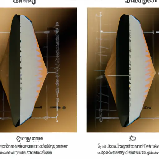
the examples between the two types of data representation can vary. In most of the cases, people care much about the main points and the way the two are distinctly constructed. It can make a difference but the way they are drawn it can have an impact on the two. As seen in the below representations, you can easily notice the difference. Here is another example of Ogive. You can compare the two and you will easily notice the difference. With all the above differences, you can easily get a clear picture of the two. There are a couple of other statistical data representation graphs but the above are the most common and the most used. Though there are no bigger differences because of the usability. Both of them are used to give a visual representation of data and that’s the main reason why not many people complain regardless of the one they use.


https://mega-store.world/ – NEW WEBSITE HERE!!! mega HERE